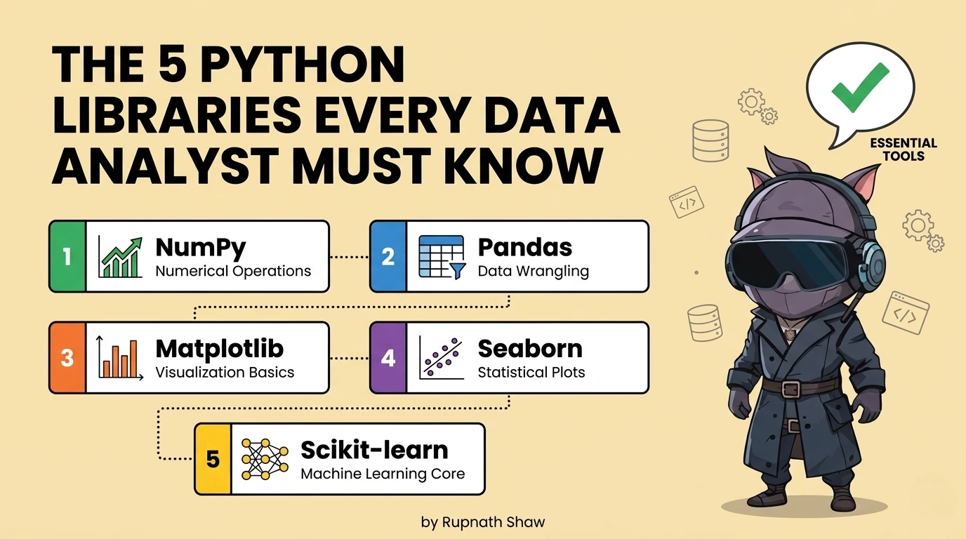
pandas is the foundation. These five are what you build on top of it and the order you learn them in matters as much as which ones you choose.
Most learning resources tell you to learn pandas and then leave you to figure out what comes next. The result is analysts who handle data well but struggle with visualization. They can’t test statistical claims. They also need to reformat reports in Excel before sending them.
These five libraries close those gaps. They are not advanced tools for data scientists. They are practical extensions of pandas. Data analysts use them with real datasets in organizations. This work leads to actual results.
The first three are non-negotiable. Every data analyst who writes Python should know them. Good analysts differ from those who can manage the entire analytical workflow alone.
Tier 1: Non-Negotiable — Learn These Before Anything Else
- NumPy
pip install numpy
NumPy helps Python do fast numerical work. It provides a multi-dimensional array and fast operations. pandas and scikit-learn use NumPy arrays. Most Python data libraries rely on NumPy, so understanding it is key.
import numpy as np
# Vectorised arithmetic — no loops needed
revenues = np.array([12000, 45000, 8900, 67000, 23000])
print(np.mean(revenues)) # 31180.0
print(np.percentile(revenues, [25, 50, 75])) # Quartiles
# Boolean masking — same pattern pandas uses internally
high_value = revenues[revenues > 30000] # array([45000, 67000])
# Where NumPy shows its speed — 1M element operation
arr = np.random.randn(1_000_000)
result = np.where(arr > 0, arr * 1.1, arr * 0.9) # Conditional vectorised op
Key features:
- Foundation for all numerical operations in pandas, scikit-learn, and every data library
- Vectorised arithmetic on arrays — significantly faster than Python loops on numerical data
- Statistical operations: mean, median, percentile, standard deviation, correlation
- Array manipulation: reshape, stack, concatenate — used constantly in data transformation
- Random number generation for sampling, simulation, and reproducible test data
| Who needs this most: Every data analyst who writes Python — NumPy is not optional, it is the numerical layer under everything you use |
- Matplotlib + Seaborn
pip install matplotlib seaborn
Use matplotlib for control and seaborn for speed and aesthetics. Matplotlib lets you fully control your charts. Seaborn builds on this with easier functions and improved defaults.
Use seaborn to create charts fast. Then, customize them with matplotlib. Import it like this:
import matplotlib.pyplot as plt
import seaborn as sns
import pandas as pd
# seaborn for fast statistical charts
fig, axes = plt.subplots(1, 2, figsize=(12, 5))
# Distribution with KDE overlay — one line
sns.histplot(df['revenue'], kde=True, ax=axes[0])
axes[0].set_title('Revenue Distribution')
# Grouped bar chart with error bars — one line
sns.barplot(data=df, x='region', y='revenue', hue='category', ax=axes[1])
axes[1].set_title('Revenue by Region and Category')
# matplotlib for custom annotation
axes[1].axhline(y=df['revenue'].mean(), color='red', linestyle='--', label='Overall mean')
plt.tight_layout()
plt.savefig('revenue_analysis.png', dpi=150, bbox_inches='tight')
Key features:
- seaborn: statistical charts in one line — histograms, scatter plots, box plots, heatmaps, pair plots
- matplotlib: full control over titles, axis labels, figure size, colour, annotation, and layout
- Subplots: multiple charts in one figure — essential for analysis reports and presentations
- Export to PNG, PDF, or SVG at publication quality — use in reports and dashboards
- Heatmaps from correlation matrices — the standard way to visualise relationships between numerical variables
| Who needs this most: All data analysts — producing charts that communicate findings is a core deliverable, not an optional extra |
- SciPy
pip install scipy
Data analysts often make claims that are stronger than the data supports. SciPy offers statistical tests, such as t-tests and correlation tests. These help check if differences are real or just random variation. This helps analysts quantify uncertainty and be more credible.
from scipy import stats
import numpy as np
# Two-sample t-test: is the difference in means significant?
region_a = df[df['region'] == 'North']['revenue']
region_b = df[df['region'] == 'South']['revenue']
t_stat, p_value = stats.ttest_ind(region_a, region_b)
print(f'p-value: {p_value:.4f}')
print('Statistically significant' if p_value < 0.05 else 'Not significant')
# Pearson correlation with p-value
corr, p_val = stats.pearsonr(df['ad_spend'], df['revenue'])
print(f'Correlation: {corr:.3f}, p-value: {p_val:.4f}')
# Chi-square test for categorical independence
contingency = pd.crosstab(df['region'], df['product_category'])
chi2, p, dof, expected = stats.chi2_contingency(contingency)
Key features:
- Hypothesis testing — t-tests, chi-square, ANOVA — to validate whether observed differences are real
- Correlation analysis with significance testing — not just the correlation coefficient but whether it is meaningful
- Distribution fitting — test whether your data follows a normal, exponential, or other known distribution
- Confidence intervals for any sample statistic
- Effect size calculations — beyond p-values to how large the difference actually is
| Who needs this most: Analysts who present findings to stakeholders and need to distinguish real patterns from noise — anyone making data-driven recommendations |
Tier 2: Separators — These Distinguish Good Analysts From Excellent Ones
- scikit-learn
pip install scikit-learn
Machine learning used by data analysts is not deep learning. Analysts use scikit-learn, a popular Python library. They run regression, clustering, classification, and dimensionality reduction. This library works with pandas dataframes and has a consistent API. Analysts use it to understand data and make predictions.
from sklearn.linear_model import LinearRegression
from sklearn.cluster import KMeans
from sklearn.preprocessing import StandardScaler
from sklearn.model_selection import train_test_split
from sklearn.metrics import r2_score, silhouette_score
# Linear regression — quantify what drives revenue
features = ['ad_spend', 'headcount', 'market_size']
X = df[features]
y = df['revenue']
X_train, X_test, y_train, y_test = train_test_split(X, y, test_size=0.2, random_state=42)
model = LinearRegression().fit(X_train, y_train)
print(f'R²: {r2_score(y_test, model.predict(X_test)):.3f}')
print(dict(zip(features, model.coef_)))
# Customer segmentation with KMeans
scaler = StandardScaler()
X_scaled = scaler.fit_transform(df[['recency', 'frequency', 'monetary']])
kmeans = KMeans(n_clusters=4, random_state=42).fit(X_scaled)
df['segment'] = kmeans.labels_
Key features:
- Linear and logistic regression — quantify relationships and produce interpretable coefficients
- K-Means clustering — customer segmentation, behaviour grouping, market segmentation
- Classification models — churn prediction, lead scoring, risk categorisation
- Preprocessing: scaling, encoding, imputation — the steps before any model runs
- Model evaluation: train/test split, cross-validation, metrics interpretation
| Who needs this most: Mid-to-senior data analysts who want to move beyond descriptive analysis into predictive work without becoming full machine learning engineers |
- Plotly
pip install plotly
Plotly produces interactive HTML charts for presentations, dashboards, and shared outputs. It lets users hover for values, click to filter, zoom in, and toggle series on and off. This is perfect for projects that involve clients or stakeholders.
import plotly.express as px
import plotly.graph_objects as go
# Interactive bar chart — one line with plotly express
fig = px.bar(
df.groupby('region')['revenue'].sum().reset_index(),
x='region', y='revenue',
title='Revenue by Region',
color='region',
text_auto=True
)
fig.show() # Opens interactive chart in browser
# Line chart with multiple series and range selector
fig2 = px.line(df, x='date', y='revenue', color='product',
title='Monthly Revenue Trends')
fig2.update_layout(xaxis_rangeslider_visible=True)
# Export to HTML for sharing without requiring Python
fig.write_html('revenue_dashboard.html')
# Export to static PNG for reports
fig.write_image('revenue_chart.png')
Key features:
- Interactive charts that stakeholders can explore — hover, filter, zoom — without needing any software
- Export to standalone HTML file — send a self-contained interactive chart that opens in any browser
- express for fast chart creation — equivalent simplicity to seaborn with interactive output
- graph objects for complete customization — every element controllable
- Scatter plots, line charts, bar charts, heatmaps, sunburst charts, and geographic maps all built-in
| Who needs this most: Analysts who present findings to non-technical stakeholders and need charts that can be explored, not just viewed — anyone producing client-facing or executive-facing analysis |
The Order to Learn Them In
Do not try to learn all five simultaneously. The sequence matters because each library builds on context from the previous one.
- Start with NumPy: Not deeply enough to understand arrays, vectorized operations, and why pandas is fast. Two to three hours is sufficient for the context you need.
- Then matplotlib + seaborn: Learn seaborn first for quick charts. Learn matplotlib for when seaborn cannot do what you need. By the end of month two of learning Python, you should be producing clean charts regularly.
- Then SciPy: Once you are exploring data and making observations about it, SciPy gives you the tools to test whether those observations are meaningful. Add it when you start asking ‘is this difference real?’
- Then scikit-learn: When descriptive analysis is comfortable and you want to start quantifying relationships and building predictive outputs. This is months four to six for most learners starting from scratch.
- Then Plotly: When you are producing analysis that will be presented or shared and you want the output to be interactive rather than static. Add it when you have a specific use case for it not before.
Wrapping Up
Five libraries. Two tiers. One sequence. Analysts who know all five are not rare. They spent six months building skills intentionally, not just learning on the fly.
- NumPy: Numerical foundation everything else needs it
- Matplotlib + Seaborn: Static charts the standard output for analysis reports
- SciPy: Statistical testing the difference between observation and evidence
- scikit-learn: Regression, clustering, classification predictive analyst work
- Plotly: Interactive charts what static visualization cannot do for stakeholder presentations
pandas gets your data ready. These five libraries explain what it means. They show it clearly, test its validity, predict its future, and present it to those who need to act. They form a complete toolkit for data analysts using Python in 2026.
Read Also:
Best Laptop for Cybersecurity Students in 2026
Best 10 Job Portals for Freshers in 2026
5 Best Laptops Under ₹60,000 for Data Analysts in 2026
Job Notification Join us on Telegram: Click here
Job Notification Join us on WhatsApp: Click here