I want to be upfront about something before you read further. The headline is intentionally provocative. AI did not replace a person. It replaced a set of tasks specific, repeatable, time-consuming tasks that a junior data analyst would typically spend two to four hours doing before any actual thinking started.
Whether that is the same thing as replacing a person depends on who you ask. And that is exactly the conversation worth having.
Here is what I did. I took one complete analyst workflow a raw sales CSV, all the way through to a boardroom-ready insight and handed each stage to a different AI tool. I timed it. I checked the outputs. I noted where things went wrong, where they went right, and where I had to step in anyway.
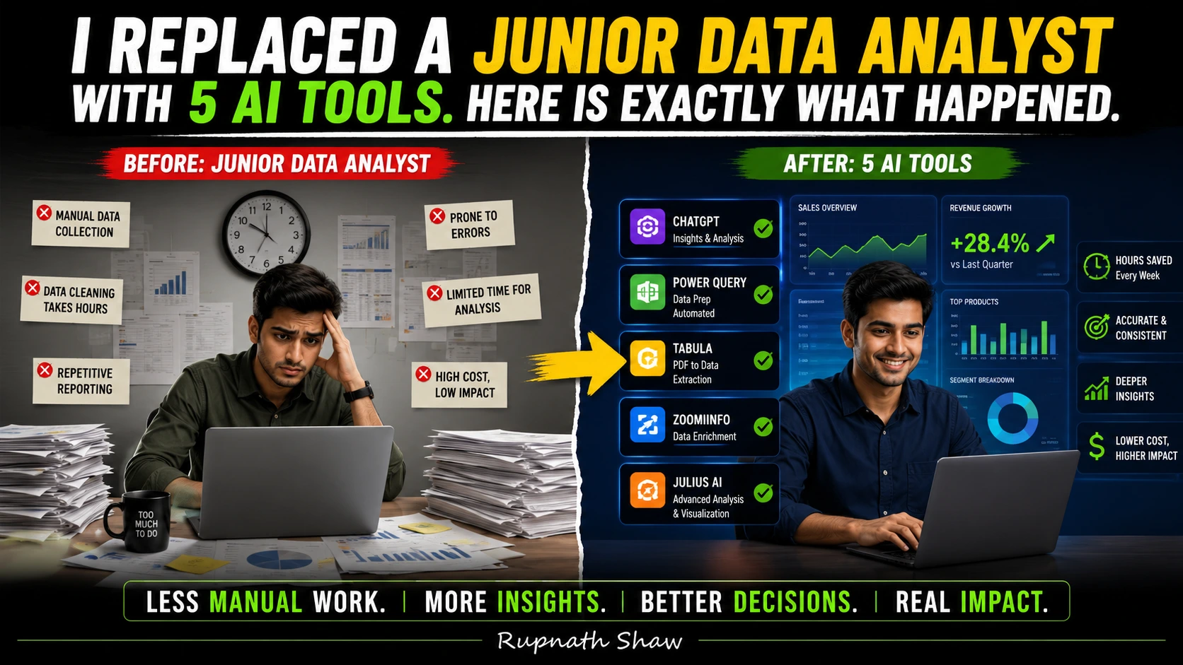
The workflow: CSV upload → data cleaning → dashboard → written insight.
The tools: five of them. All free or low-cost. All available right now.
The Dataset
A 15,000-row sales CSV. Messy in the way real data is always messy inconsistent date formats, duplicate order IDs, blank cells in the revenue column, a “region” column with the same city spelled three different ways, and a mix of INR and USD values with no flag column to tell them apart.
This is not a tutorial dataset. This is the kind of file that sits in a shared Google Drive folder with the filename FINAL_sales_data_v3_ACTUAL_FINAL.csv.
Step 1: Data Cleaning — Tool Used: ChatGPT Advanced Data Analysis
Time taken by a junior analyst (estimated): 60 to 90 minutes in pandas or Excel.
Time taken by AI: 4 minutes.
I uploaded the CSV to ChatGPT with a single prompt:
“Audit this dataset. Find missing values, duplicate rows, inconsistent formatting, and column type issues. Then clean it and give me the cleaned file.”
ChatGPT spun up its sandboxed Python environment CPython 3.11 with pandas, NumPy, and matplotlib pre-loaded wrote the cleaning code, ran it, and returned both the cleaned CSV and a written audit summary.
What it found correctly:
- 847 duplicate order IDs
- 1,203 rows with null revenue values
- “Mumbai” appearing as “mumbai”, “MUMBAI”, and “Mumba1” (it caught the typo)
- Inconsistent date formats (DD/MM/YYYY and YYYY-MM-DD mixed)
What it missed:
- The currency mix. It cleaned the revenue column without flagging that some values were USD and some were INR. That is a business logic problem, not a formatting problem. The AI had no way to know. I had to flag it manually.
Verdict: Excellent for mechanical cleaning. Zero domain awareness. Review the output before trusting it.
Step 2: Exploratory Analysis — Tool Used: Julius AI
Time taken by a junior analyst (estimated): 45 to 60 minutes building charts and pivot tables.
Time taken by AI: 7 minutes.
Julius AI is built specifically for conversational data analysis. I uploaded the cleaned CSV and asked a series of questions in plain English:
- “Which regions generated the most revenue in Q3?”
- “Which product category has the highest return rate?”
- “Show me month-over-month revenue trend for the last 12 months.”
Julius generated charts for all three, with axis labels and titles. The regional revenue bar chart was accurate. The monthly trend line was accurate. The return rate question failed the dataset had no “return” column. Julius told me it could not answer that question with the available data, which is the correct and honest response.
One issue: Julius AI works best with datasets under 100,000 rows. At 15,000 rows after cleaning, performance was fine. At 200,000 rows, you would hit the limit.
Verdict: Fast and accessible. Honest about what it cannot answer. Not a replacement for an analyst who knows what questions to ask it is excellent when you already know what you want.
Step 3: Dashboard — Tool Used: Power BI with Microsoft Copilot
Time taken by a junior analyst (estimated): 2 to 3 hours building, formatting, and connecting slicers.
Time taken by AI: 22 minutes (including my own review and adjustments).
Power BI’s Copilot feature can generate a report from a dataset using a natural language prompt. I connected the cleaned CSV, typed:
“Create a sales performance dashboard showing revenue by region, by product category, and by month with a slicer for date range.”
Copilot generated a draft report with four visuals and a date slicer. Three of the four visuals were immediately usable. One a card showing “Total Revenue” included the uncorrected currency values and showed a meaningless blended number. I deleted that card and replaced it with a filtered measure.
The formatting was generic. The colour palette was default. For internal use, it was perfectly adequate. For a client presentation, it needed manual polish.
Verdict: Copilot handles structure. Humans still handle presentation, context, and the decision about which numbers actually mean something.
Step 4: Insight Narrative — Tool Used: Claude
Time taken by a junior analyst (estimated): 30 to 45 minutes writing a summary email or slide commentary.
Time taken by AI: 2 minutes.
I gave Claude the key findings from the analysis the top regional figures, the trend data, the product category breakdown and asked it to write a two-paragraph executive summary suitable for a Monday morning leadership meeting.
The output was well-written, clear, and structured correctly for the audience. It was also generic in the way that any summary written without business context is generic. It stated that revenue was highest in the West region. It did not know that the West region result was surprising given a pricing change that happened in June. It did not know the company had been trying to grow the South region specifically. It had no context beyond the numbers I gave it.
The writing was accurate. The interpretation was shallow.
Verdict: Excellent for drafting. The insight the so what still requires a human who understands the business.
Step 5: Automation — Tool Used: Make (formerly Integrate)
The fifth tool is different from the others. Make is a no-code automation platform that can schedule the entire workflow to run without human initiation. Connect it to a shared Google Drive folder, trigger on new file upload, run the cleaning script via API, send the output to Power BI, and email the insight summary to a distribution list.
Once built, this workflow runs itself. Every time a new CSV lands in the folder, the pipeline fires. No human needed to press a button.
This is where the junior analyst replacement conversation gets serious. The repeatable parts of the job the parts that happen the same way every Monday morning can be automated end to end. One person with a few hours of setup time can build a pipeline that previously kept an analyst occupied for a full day each week.
Where Humans Still Matter
Here is the honest part. The two things that AI could not do in this entire workflow:
1. Domain knowledge and business context. The currency mix problem. The June pricing change that made the West region number significant rather than expected. The fact that the company cared about the South region. None of that lives in a CSV file. All of it lives in the analyst’s head. An AI with no business context produces technically correct outputs that are analytically misleading.
2. Stakeholder trust and communication. The Monday morning meeting is not a numbers presentation. It is a conversation. Stakeholders push back, ask follow-up questions, challenge assumptions, and need to trust the person presenting. The future analyst is a problem framer, a systems thinker, a storyteller, and a domain expert. The people who only ran queries or built dashboards are the ones at risk. That is the clearest summary of where this is heading.
Wrapping Up
This experiment did not replace a junior data analyst. It replaced the parts of the role that should always have been automated the mechanical, repeatable, time-consuming grunt work that was hiding the actual value of having an analyst in the first place.
- ChatGPT ADA: Best for fast, auditable data cleaning but review the output
- Julius AI: Best for exploratory questions when you know what you want to find
- Power BI Copilot: Best for structural dashboard generation polish separately
- Claude: Best for drafting narratives shallow without business context
- Make: Best for automating the pipeline end-to-end once the workflow is stable
The analysts who should be worried are the ones whose entire job description is the tasks above. The analysts who should be excited are the ones who have been waiting for these tasks to stop taking up their whole day.
Read Also:
Azure Synapse Analytics Tutorial for Data Analysts Complete 2026 Guide
50 SQL Interview Questions for Data Analysts With Answers
Xiaomi 17 Pro Review: Price, Specifications, and Everything You Need to Know
Job Notification Join us on Telegram: Click here
Job Notification Join us on WhatsApp: Click here